
NovaStride
Novastride is a project management platform built specifically for designers and developers, focused on streamlining workflows and enhancing collaboration. Its mission is to help teams stay organized, meet deadlines efficiently, and achieve their goals with clarity and precision. By strengthening its visual brand identity, Novastride aims to stand out in a competitive landscape alongside platforms like Trello, Notion, and Asana, offering a more tailored and visually engaging experience for creative and technical professionals.
Services
Brand Design
Instagram Template Design
Logo Design
Open Page Mockup
App Icon

Problem & Solution
Problem: The original brand was unappealing and didn't represent the company the way it should.
Solution: Revamp the brand visually that best presents the company of Novastride in professional manner while incorporating the companies core values.
Market Research
Target Audience: Novastride's main target audience are creatives and developers seeking are much more intuitive and trusting and less expensive means of keep tracking of their projects.
Competitors: Novastride has some competition: Notion and Trello
Visual Direction: In my experience as a designer I have learned that other designers will focus on colors to communicate brand values, Novastride strides for trust and innovation and orange or excellent color communicators for those values. Everyone want's organization to simple so for a logo I decided to make something complex so for the logo I went for a minimal nova collapse. For typography I used the same principle while maintain consistency I picked one font for both heading and text the only difference will be is weight and font size.
Mission: To make planning and organization for creatives easier
Vision: Become the top performing and most trusted organization app for creatives
LOGO DESIGN COCEPTS
At first I thought a simple detailed icon was the best the way to go, but then I realized that the mission behind Novastride is to be simple, so I decided it would be best to just simple shapes and at the same time find a way to incorporate the icon into the wordmark.

Color Scheme
I decided to go with two colors for the brand that best communicates their beliefs and core values.
Blue: NovaStride's audience expects a fitness app they can rely on. Before downloading the app, users need confidence that it is dependable, credible, and built to support their fitness journey. Blue was chosen as the primary brand color because it is widely associated with trust, reliability, and security. By incorporating blue throughout the brand identity, NovaStride communicates a sense of confidence and professionalism, helping establish trust with users from their very first interaction.
Yellow: NovaStride and its target audience share a commitment to innovation and continuous improvement. Yellow was incorporated into the brand identity because it is commonly associated with optimism, forward thinking, and innovation. By incorporating the color yellow into the brand identity it can show the user that Novastride stands firm on that value.
Typography
Novastride's customers expect to believe that this brand thinks like a freelancer and remote worker. The best typography for a brand like this is sans-serif.

LOGO VARATIAONS


LOGO DESIGN

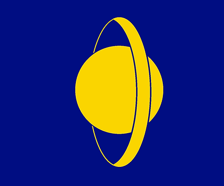
Novastride's main target audience are technical designers working in web applications and development so the best implementation here from a professional stand pint is the make the logo sleek and modern.
I replaced the O with a Super Nova to incorporate a monogram design and had the nova flare going forward to communicate progression.
Instagram Templates
Novastride knows that it's target audience has grown up with memes, they wanted to ensure that they can promote their product through entertainment. Novastride as it inspires innovation it also wants to make that known to its users of new updates that come out.


Results / Deliverables
Brand Identity: A newly updated visual identity that aligns with the core values of NovaStride and newly updated logo with variants for different mediums and merch that NovaStride will provide.
Opening Page: A newly updated opening page that combines the color scheme on the brand with the professionalism that the company wants to projects.
Instagram Template: Two templates and deliverables that promote their product and what it can do.
App Icon: Novastride now has a new app icon that doesn't need to use any typography but rather just a blue watermark.